General practitioner Eden
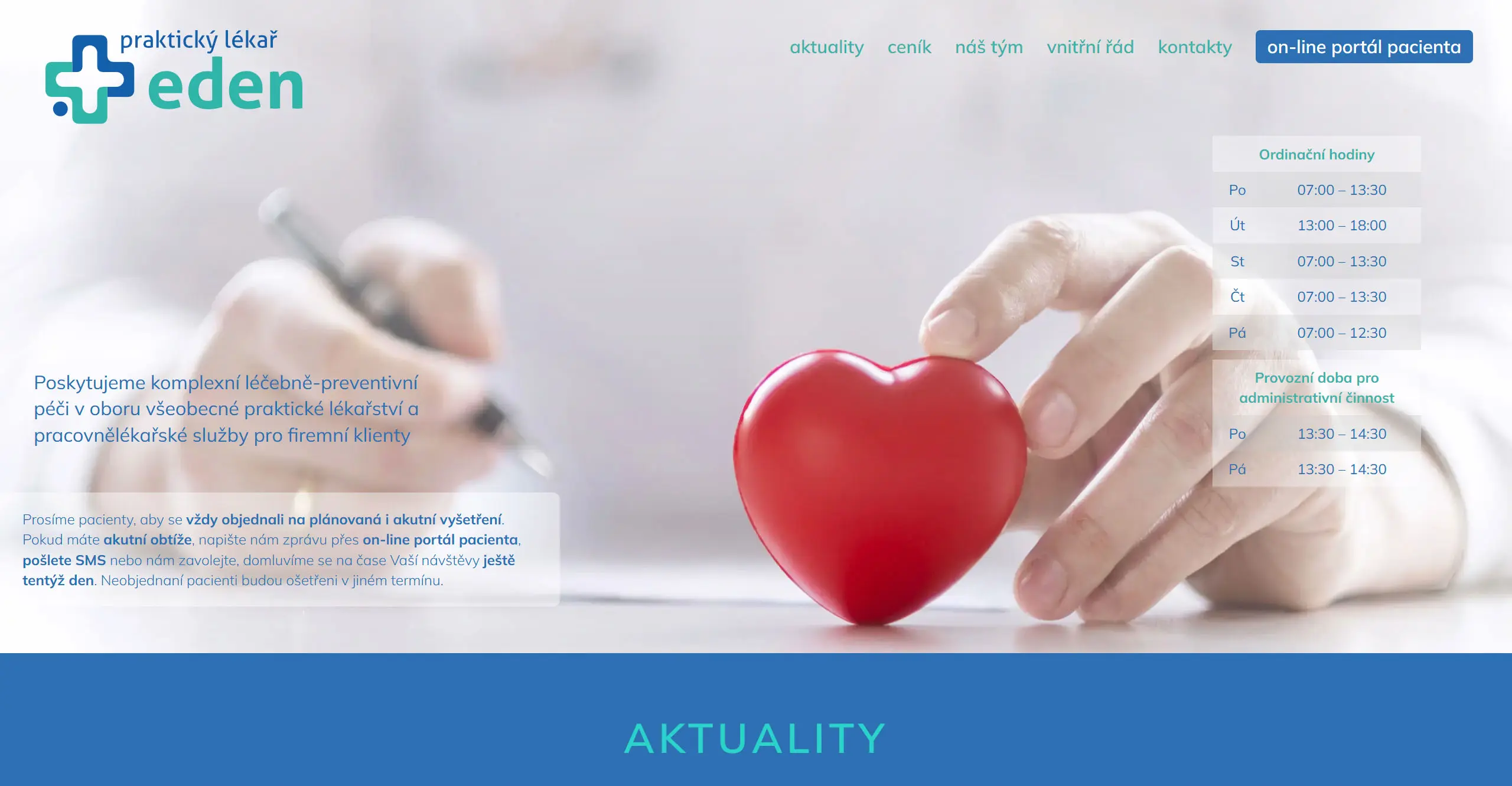
Praktický lékař Eden is a medical facility providing services of a general practitioner for adults in Prague. The clinic offers comprehensive patient care with an emphasis on a professional approach and modern diagnostic methods. The clinic offers comprehensive patient care with an emphasis on a professional approach and modern diagnostic methods.
Client assignment
The doctors needed to create a website for the newly established practice that would provide patients with easy-to-understand information while facilitating the day-to-day administration of the medical facility staff.
The main requirements included:
- Creating a clear website with a simple design that would allow patients to navigate easily and quickly.
- Implementation of a reservation system
- System for easy updating of office hours and important notifications
- View contact information and practice location
- Easy site administration for staff without the need for technical knowledge
Solution and technical design
For the implementation of the practice’s website, we have created a complex customized solution with the following elements:
- Responsive design in colours that evoke the medical environment (combination of blue-green and white tones)
- Reservation system with the possibility of choosing a specific date of visit
- Display of surgery hours with colour differentiation
- System for publishing news and important announcements (e.g. holidays, change of surgery hours)
- Map with the exact location of the surgery
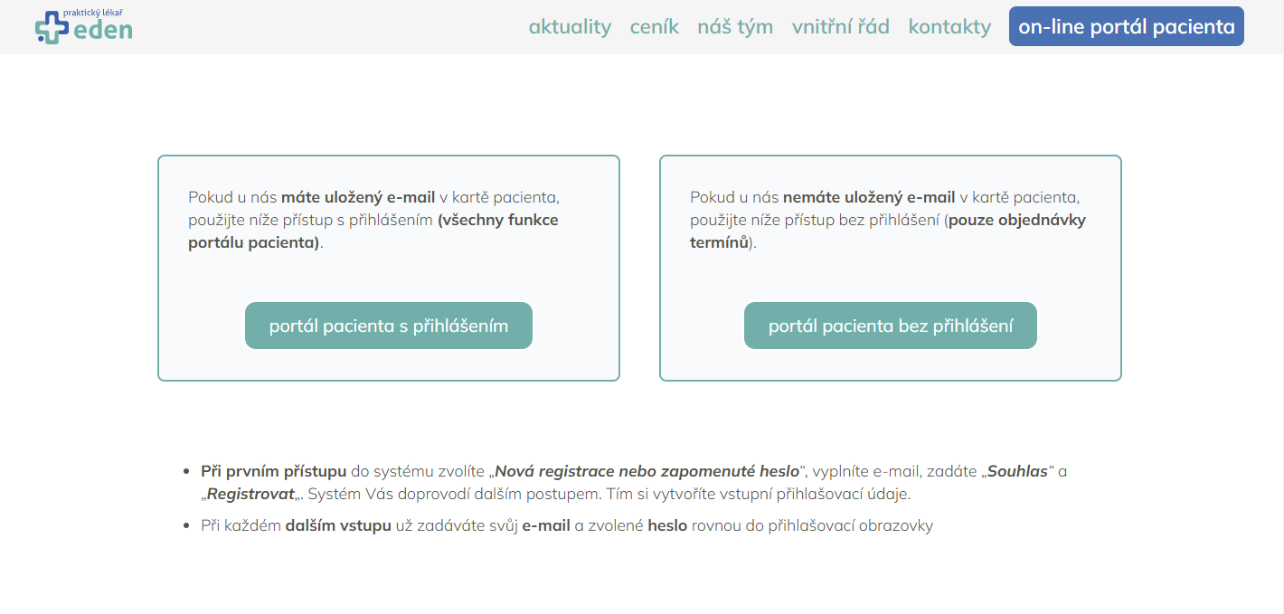
Reservation system
The implementation of the booking system “On-line patient portal” allows patients to make an appointment with a doctor without the need for telephone contact.
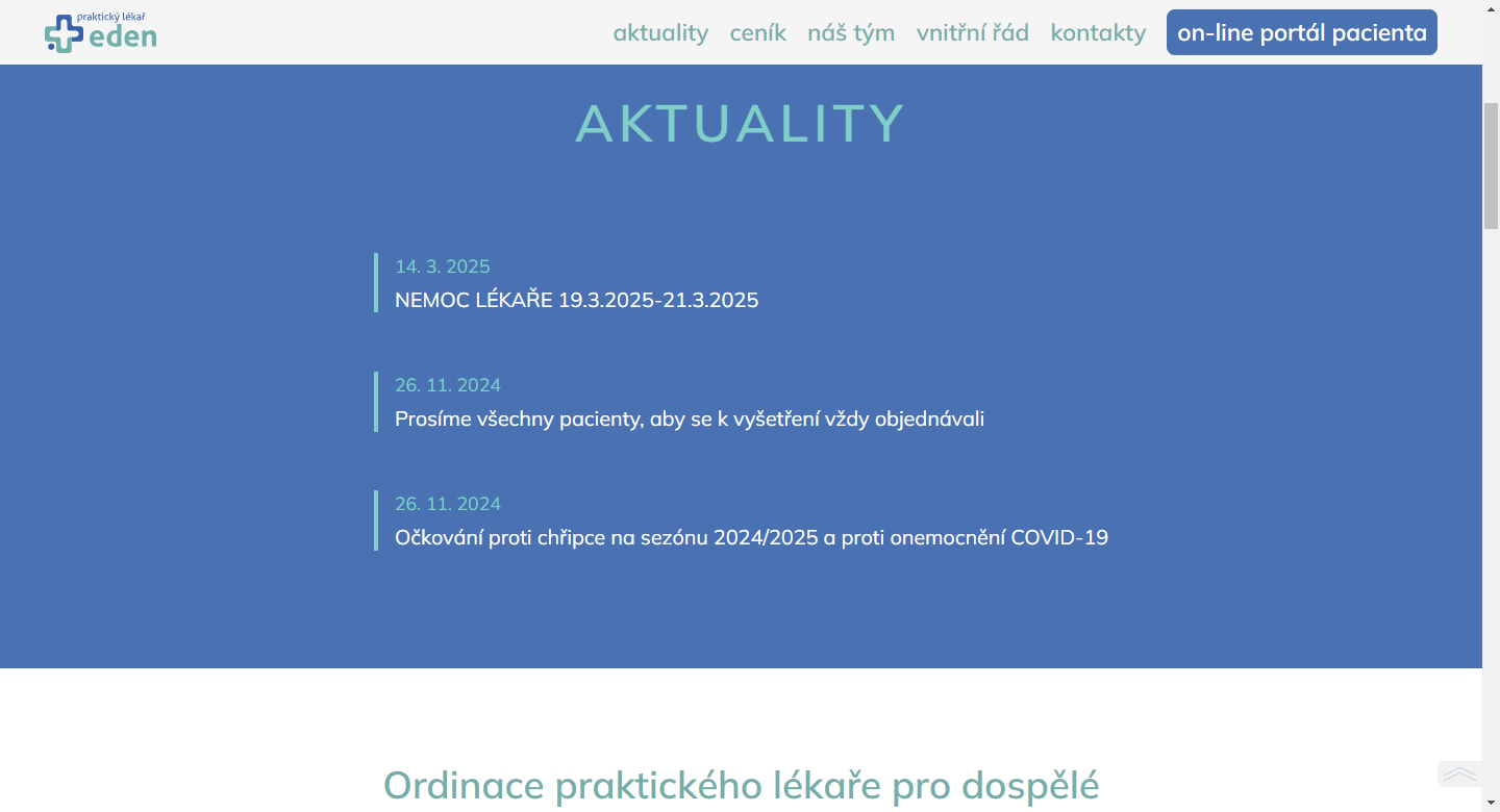
List of news
The implemented update system allows the practice staff to quickly inform patients of important changes.
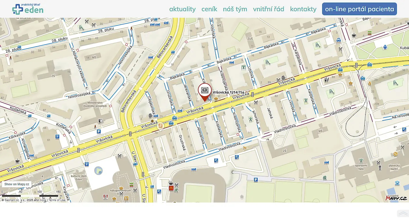
Map of the surgery
To ensure easy navigation of patients to the surgery, we implemented an interactive map from mapy.cz.
Responsive navigation
The website uses modern responsive navigation that automatically adapts to the screen size of the device. On mobile devices, the menu is transformed into the so-called. “hamburger” icon, which, when clicked, neatly expands the navigation options.